The Fearless Optimism Challenge for Independent Artist Day

Judges' Picks and Statements
On April 3rd, we announced the winners of the Fearless Optimism Challenge for Minted's first Independent Artist Day. An esteemed panel of judges, made up of the Design Challenge winners from the past 15 years, chose a group of winning designs through a blind process. We asked each judge to share a sentence or two on why they were drawn to their particular piece, and we wanted to share them here.
Congratulations again to all the winners!
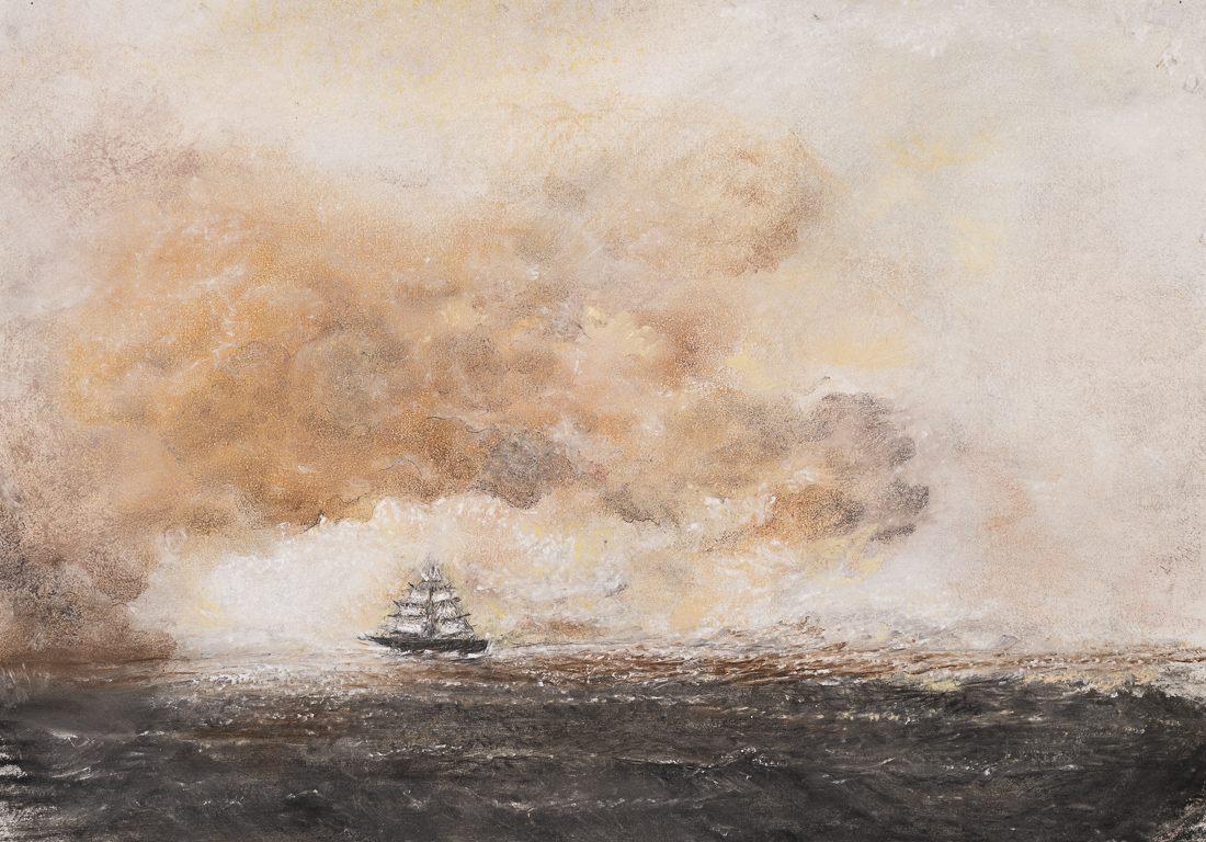
after the storm by Ramnik Velji
Picked by Rachel Nanfelt of Alethea and Ruth
I am especially drawn to the hopeful glimmer of light that is emerging on the horizon. It feels like the storm is still near in the texture of the paint on the choppy waves and billowing clouds, but the promise of calmer water and peace seems very near. I love seeing the storm and the glimpse of what is beyond in the same frame.

Azalea en Noir by Catilustre
Picked by Brandy Brown
As a self-described anthophile, I was drawn to the simplicity and gestural genius of this painting.

be loved I by Lindsay Megahed
Picked by Julia Contacessi
This abstract has a stunning sense of light and movement. Paired with the color palette, the overall feeling is without a doubt upliftment and positive vibes. It's beautiful and something I'd love to have hanging in my home.

Beige Flower by Alisa Galitsyna
Picked by Annie Mertlich
I love all the subtle and organic textures mixed with the fun bold shapes! It is both elegant and playful at the same time!

Blue Rain by marcia biasiello
Picked by Lori James
This piece is absolutely stunning! I love the bold, vivid colors and the lovely rain blossoms and details. The artist's description is such a beautiful narrative of hope and love, and it really shines through in this painting. Love!!

Botanical burst by Creo Study
Picked by Stacey Day
I love the minimal design combined with the beautiful washes of color.

Bursting Life by cyrille gulassa
Picked by Caryn Owen
This piece really just popped for me. The pink shades and touches of gray blues along with the texture and depth of the composition just screamed optimism and hope. I love this piece!

center stage by Carolyn Nicks
Picked by Jana Volfova
I love the arching shapes in this design, how they overlap and how they incorporate the photo. The colors are modern, yet muted and the placement of copy is balanced.

color frenzy by Carrie Moradi
Picked by Jennifer Wick
Why I chose “color frenzy”: The fresh, unique color palette unites the organic paint marks and translucent cut paper into a pleasing composition that holds a resolved tension which I feel perfectly captures the theme of “Fearless sense of optimism". There is a wonderful sense of movement between the shapes that continually draws me in to the piece.

daydreaming by Sumak Studio
Picked by Annie Clark
the mix of media, the repurposed vintage photograph paired with the vibrant watercolor hues imbued a sense of free-spirited optimism.

Delightful Growth by Dawn Pope
Picked by Allison Brennan & Jessica Tree
We love how positive this cute greeting card is! Perfect for any little graduate to show them just how proud you are. The illustration is simple and sweet and would sell well in a retail setting.
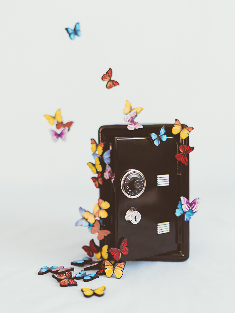
Emergence by Kamala Nahas
Picked by Sweta Modi of Creo Study
This photograph sums up everything I associate with ‘the fearless sense of optimism’ theme. The butterflies seem to have emerged even more beautiful in spite of being locked inside the darkness of the safe. Their emergence signifies freedom from the fear of despair and hopelessness that the pandemic brought in. Their subsequent flight brings in hope and confidence through their unabashed movement. And their vibrant colors signify that no amount of darkness can take any from your being and we can emerge brighter and stronger from any circumstance that life puts us in.

Endless Possibilities by Kristen Smith
Picked by Erin McManness
This design is just stunning. It combines gorgeous hand-lettering with appealing and playful illustrations, and a fresh and vibrant color palette. Not only did it joyfully embody the brief of "fearless optimism", but it is strong in its technical execution and would be a card I'd love to give or receive.

Flight Path by Lindsay Megahed
Picked by Karidy Walker
This painting makes me feel like I can take a deep breath and move forward from the challenge of the last two years. It's as if you're walking toward the ocean and can smell the freshness in the air.

flourish by Alicia Abla
Picked by Eve Schultz
I love how this image is full of beauty and colour, but is also calm and serene. Looking at it makes me feel optimistic.

Flowering by Sonal Nathwani
Picked by Phrosne Ras
The burst of color speaks of growth, hope, happiness and optimism. I love it.

Go For It by Gwen Bedat
Picked by Lori Wemple
This is beautifully illustrated and very supportive. definitely a piece I would love to own or share with someone for encouragement.

Harmony by Shawna Urban
Picked by Erika Givens
I really appreciate the meaning behind this leaf... that it represents one in a collection of many that fell out of tragedy/storm/hardship, one of many in a community that came together. It in a collection has meaning, but it isolated in its resilient softness and grace also has meaning. The way it is softly reflected below and connected in line, hue, and shadow feels really good. The soft little light flare right in the middle feels magical. This piece feels incredibly optimistic and beautiful.

In Memory Of by Heather Karp
Picked by Chris Griffith
The colors, the brush stokes and the depth of this painting really resonate with me. I can see it in a very modern setting, and it also would be stunning in a more traditional, transitional setting.

In the Pink by Erin McCluskey Wheeler
Picked by Lindsay Megahed
What spells out fearless optimism to me in this piece is the unexpected bold color contrasts, playful shapes and quirky mix of media that instantly drew me in. I can perfectly visualize in this eclectic piece the artist’s story about holding onto pieces, even the accidents (fearless), until they find their purpose (optimism) in the bigger picture.

Joy Comes in the Morning by Sharise C Williams
Picked by Katy Abraham
When I first saw this piece I was completely drawn in. The smile on the woman’s face felt like an invitation to not merely observe her joy, but to jump in and participate fully in it. Joy is contagious.

Modern Arches by AlisonJerry
Picked by Eric Comstock
It‘s a painting I could look at for a long time. I love the shapes, the color and the various marks.

paper butterflies by Kamala Nahas
Picked by Susan Moyal
I love how these happy butterflies are fluttering so freely across the design. The unique style, shape and texture of each butterfly really draws me in. Butterflies transform and completely change into something new, fearless and full of possibilities, so this design really resonates with the challenge description for me.

Paper Flower by Chi Hey Lee
Picked by Tanya Nipat
I chose this design, "Paper Flower" because instead of simply throwing her son's paper cuts away, she positively created something meaningful out of them. It shows her optimistic perspective very well.

Radhaben and the Gold Coins by Kamala Nahas
Picked by Morgan Ramberg
The artist was inspired by the life of her Grandmother to create “Radhaben and the gold coins," and I could instantly feel that love and connection looking at the artwork. The warm neutral palette combined with different textures drew me into the scene further. It’s a piece I’d love to have in my home!

Rising Sun by Katie Wahn
Picked by Kristy Kapturowski
I love all the textures and layers in this collage! My eye moves around the composition wanting to explore the nuanced marks and details. The color palette achieves a happy balance of understated color and neutrals that I'm drawn to.

sand of whispers by AlisonJerry
Picked by Nam Bourassa
Love abstract art. this artwork exudes an ethereal feeling using gorgeous calming colours. The texture is subtle yet gives a dimension in the work.
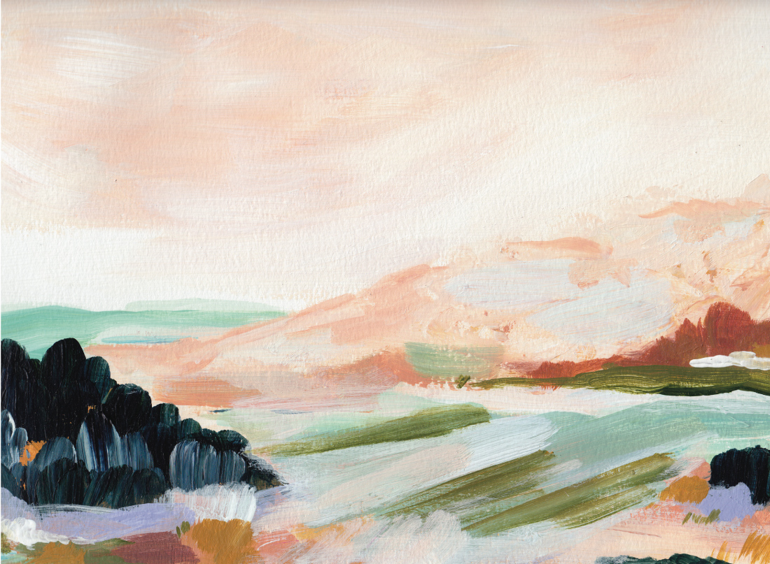
Sandstone Cliffs by Kayla King
Picked by Petra Kern
This design just makes me happy: the colours, the movement, the landscape ...

Spring Is In The Air by Lisa Sundin
Picked by Eric Beckett
The soft color palette along with the beautiful, yet unexpected, shapes feel like a peaceful moment caught in time.

state of mind by bari wieselman schulman
Picked by Lindsay Madden

Summer Flowers by Mojca Dolinar
Picked by Erica Krystek
For me, the vibrant, bold summer hues used in this piece perfectly epitomize optimism. It instantly made me feel warm, happy and hopeful.

sundae by chocomocacino
Picked by Kristie Kern
This piece exudes optimism with its playful composition and joyful palette.

Sunshine falls by AlisonJerry
Picked by Karen Glenn
The abstract nature of this painting allows the viewer to imagine multiple types of landscapes. The work manages to evoke both a feeling of calm and also a sense of energetic optimism in the what the future holds.

There is sunshine after the rain by Caroline Bonne Muller
Picked by Karly Depew of Oscar and Emma
Children really are fearlessly optimistic. The artist did a great job quite literally telling this narrative by showing how a child will see the rain as an opportunity to help a plant thrive, while all the adults go about their day being inconvenienced by the rain. Overall, I love the artist's illustration style and choice of yellow to represent optimism.

Traveler by Shawna Urban
Picked by Jess Franks
The atmosphere immediately connected with me. I could imagine myself in our car, sun blazing down, land flashing by, heading toward an exciting adventure, the cares of every day life quieting down as the tunes are cranked up. You can't help but be optimistic.

You Inspire Me by Alethea and Ruth
Picked by Alston Wise
Everyone has dealt with challenges over the past couple years, so to give someone a card with such fun type and holographic treatments that recognizes the way they are showing up each day felt true to the prompt of a fearless sense of optimism, that we can get through anything with each other. We need to send each other more "just because" cards, and this design has inspired me to do that!